
Vampire Survivors: take away aiming, give movement more work
The weapons handle the attacking. You handle being in the right place, collecting what makes you stronger, and deciding how this run should grow. Removing an input can make the remaining one more interesting.
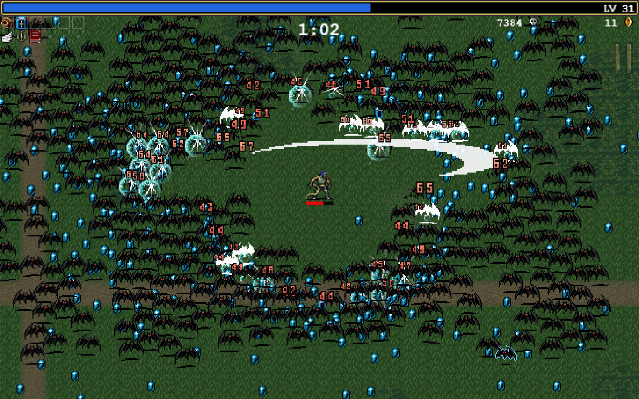
Open space near the character, danger farther out, and gems scattered through both: one direction has to serve several competing goals.
In this guide
Source-based analysis of the core solo survival loop, rather than every character, expansion, or update. The turn-based experiment is an original abstraction that isolates movement and collection; it is not the real game’s combat model.
- Made by
- poncle / Luca Galante
- Looking at
- Core solo survival loop
- Design question
- Positioning, collection, and power growth
The design bet: simplify the hands, keep the decisions
Vampire Survivors describes itself as a time-survival game with minimal gameplay and roguelite elements. Automatic attacks, gathering experience, and choosing upgrades let a run grow from a modest start into a much busier battlefield. The official store description gives new players a compact set of survival and upgrade tips.
Our reading is that removing manual attacks reallocates attention rather than removing the player’s job. Movement has to support safety, collection, and useful attack positioning. A single direction can serve one goal while making another harder.
That distinction matters when simplifying your own controls. Deleting a button helps only if the remaining decisions form an interesting activity. Otherwise you have made a more convenient way to watch a system run.
The safest place is not always the most useful place
Imagine an original arena with a pulse that clears nearby enemies automatically. A pile of experience sits just beyond the safest route. Walking away preserves space, but leaving the pickups behind delays the next upgrade. Walking through them can improve the future while making the next few seconds dangerous.
The pickup’s location is doing design work. If every reward appears directly in your inventory, the player can optimize only for escape. Put rewards in the world and movement also becomes a question of when to collect, what to leave, and whether to circle back.
There is a limit. If rewards are visually lost under effects or require tedious cleanup after the danger has passed, collection can turn into maintenance. The useful tension is choosing a route under changing conditions. The chore is walking around because the interface scattered the answer.
For a prototype, mark the safe route, the rewarding route, and the route that helps your attack. If all three are always identical, try changing one spatial relationship. You do not need more weapon buttons to make movement matter.
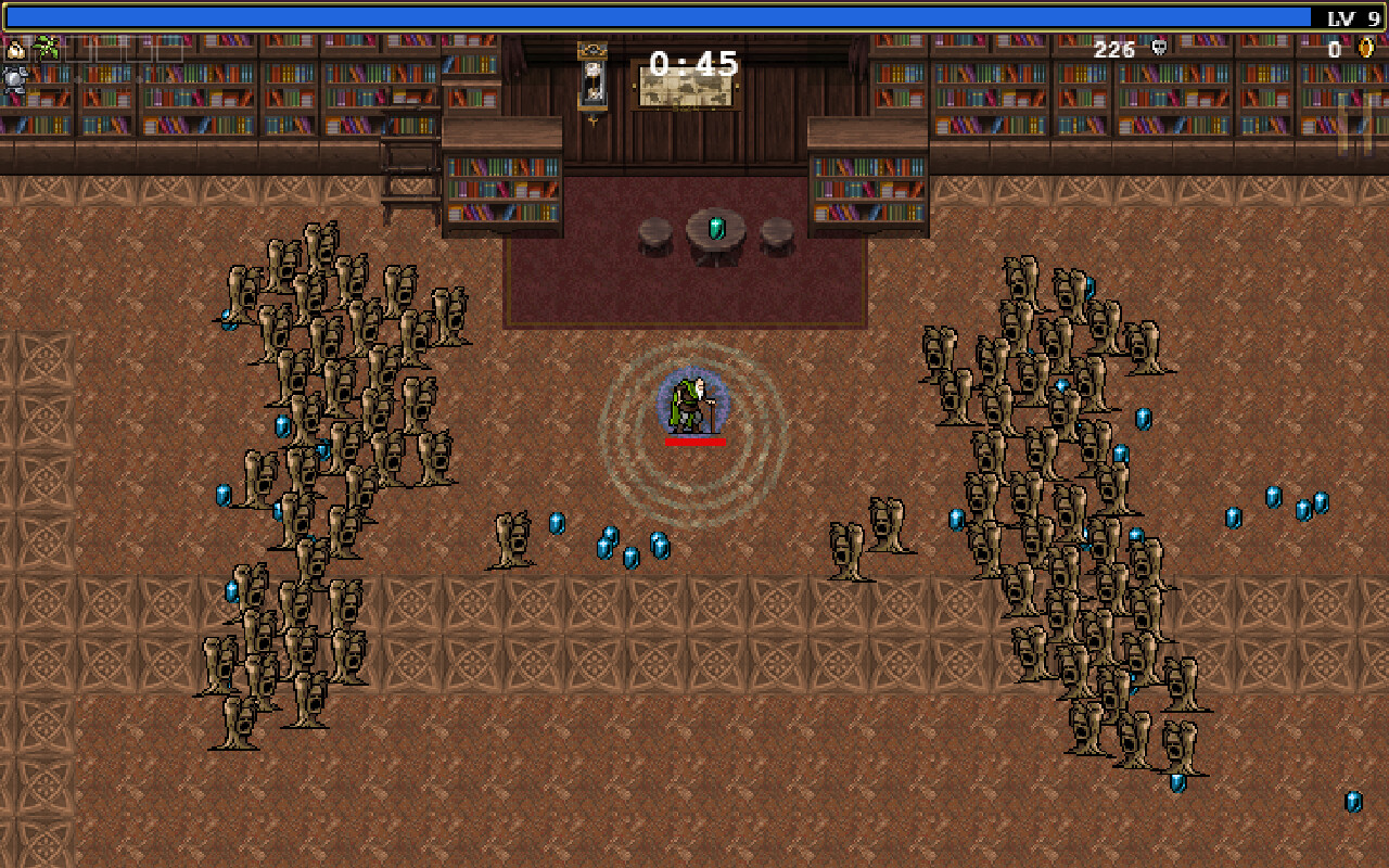
The corridor makes the route question visible. Enemies occupy both sides, while the experience sits on the floor between and behind them. Staying clear and collecting progress pull at the same movement decision.
Play it: move for space or move for progress
This small board makes the tradeoff inspectable. You move once per turn; an automatic pulse clears adjacent threats on every second turn. The remaining threats move toward you. Gems advance a visible goal. Everything happens in turns so you can explain your choice before making it.
Try to collect three gems within eight moves without letting a threat reach you. Then restart and compare a route that avoids gems. The abstraction removes real-time timing and build variety on purpose; it asks only whether collection gives movement a second job.
The pickup route
Collect three gems in eight turns. Moving onto a threat loses immediately. After your move, a pulse clears adjacent threats on even-numbered turns; remaining threats step toward you, horizontally first. Reaching you ends the attempt.
Circle: you. Diamonds: gems. Triangles: threats. Next turn: 1; no pulse.
0 of 3 gems · turn 0 of 8. Choose a route.
Read the exact board positions
You: (2, 3). Gems: (3, 2), (4, 4), (6, 3). Threats: (7, 1), (7, 5). Coordinates are column, row from the top left.
An upgrade can change what the next minute is about
In a growing survival game, an upgrade is more useful when it changes how a player can act than when it merely makes a number larger. A wider attack may let you approach a crowd differently. A faster attack may shorten a dangerous interval. A new attack direction may make turning or circling more valuable.
Not every upgrade needs to invent a new behavior. A reliable increase can keep a familiar plan viable. The important question is whether the player can notice the effect and connect it to a choice. A percentage increase that is immediately cancelled by tougher enemies may be mathematically necessary but experientially invisible.
Try three upgrade cards in your own room: more reach, more frequent pulses, and more pickup range. Keep damage out of the comparison at first. After choosing, ask the player which path now seems reasonable. If the answer never changes, the upgrades may not yet have distinct spatial roles.
A short pause to choose can also punctuate continuous action. It gives the player a moment to inspect the run and form a plan. If the menu is so dense that the action is forgotten, the pause has become an interruption. If the choice is automatic, it may not need a menu at all.
Becoming powerful needs something to compare against
A dramatic later state depends on remembering a less capable earlier one. If the player begins with every effect firing at full strength, spectacle has no visible direction of travel. A restrained opening gives an upgrade room to be felt.
But a weak beginning should still contain a game. Waiting for enough damage to make anything interesting is not an inevitable cost of progression. Even a modest attack can create timing, spacing, or route decisions if the first threats are built around it.
In an original prototype, keep one recognizable enemy present across several upgrades. The player can see that a threat which once required a detour is now manageable. You may also introduce a new problem, but do not erase every reference point at the same instant.
This is a design hypothesis about readability, not a claim that a particular power curve maximizes retention. Test whether people can name what changed. If they only report that the screen became louder, inspect the relationship between the upgrade and the challenge.
A busy screen still needs an order of importance
A survival game can look extravagant while retaining a strict information hierarchy. The player needs to locate themselves, recognize immediate danger, see a route, and understand valuable pickups. Everything else competes for the remaining attention.
Make a cheap visibility test. Replace your character, threats, rewards, and attack effects with four different shapes. Play a busy moment. Then restore the artwork one layer at a time. If the useful route becomes harder to see after an effect returns, that effect needs adjustment rather than another outline around everything.
Sound can reinforce the hierarchy, but avoid making it the only indication of danger or success. A muted phone, competing noise, or a player who cannot hear a cue should not turn the same room into an unrelated challenge.
One productive constraint is to let a powerful effect look large while keeping its center or edges visually simple. The exact solution depends on your game. The aim is to communicate power without making the player disappear inside it.
Do not mistake a readable core for a tiny finished project
Galante’s early interviews describe a spare-time project that developed through experimentation. They are valuable accounts of how this particular game grew. They do not establish that its eventual range of enemies, weapons, interactions, and platforms is cheap to reproduce.
The temptation is to copy the final content count because the controls look simple. Yet each new weapon needs readable behavior, useful interactions, and a place in the progression. Each new threat needs to remain understandable when many other things are happening. The test surface grows even when the input list does not.
A sensible first milestone is one character, one arena, one automatic attack, two threats, and three upgrades that change movement decisions. If that room is dull, a catalogue of unlocks is an expensive way to postpone finding out why.
What happens if every gem is collected automatically?
Automatic collection would remove one reason to approach danger. That might improve a game whose pleasure is pure evasion. It might weaken one whose interesting decisions involve returning for growth. The change is not inherently generous or harmful; it shifts what the player is optimizing.
Compare two versions with the same attacks and enemy schedule. In one, rewards remain on the ground. In the other, they arrive immediately. Watch routes rather than asking only which version people prefer. Do they turn back? Do they wait for an opening? Does a pickup-range upgrade have a purpose?
If the first version creates detours but nobody enjoys considering them, the spatial tension may be the wrong one for your game. Keep the observation. The reference game does not get a vote in your playtest.
Experience is also a route-planning problem
A reward on the ground has a location. Getting it takes time and changes where you stand when the next danger arrives. That is why it matters that a movement decision can also be an investment in future power. A pickup is not simply a number waiting to be added to a bar.
In our arena, first find a route that gets all three gems. Then replay while trying to leave the widest escape route after each pickup. Are those the same route? The fixed pulse gives you a reason to care about where enemies will be a turn later. Taking the nearest gem is not necessarily the same as improving your next position.
Now sketch an upgrade threshold after two gems. A player close to that threshold may accept a risk that makes little sense just after leveling. You have changed the value of a pickup without changing its printed reward. The missing piece in a collection-only model is the future action it buys.
Work through an upgrade before adding twenty
These are proposed upgrades for our original arena, not a list of Vampire Survivors weapons. Choose one and draw its effect across the next four turns. If all three produce exactly the same route, the board may not expose their differences. Change the situation before adding more options.
An upgrade choice works best when the player can connect it to a recent problem. “I cannot reach rewards without getting trapped” gives pickup reach a purpose. A percentage increase shown before the player understands the base action can be technically clear and strategically empty. Let the opening encounter teach what needs improving.
| Original upgrade | Immediate benefit | New behavior to test | Cost or weakness |
|---|---|---|---|
| Wider pulse | Hits one extra ring of nearby threats. | Can the courier stay near a cluster? | Does not help with threats outside the pulse moment. |
| Quicker pulse | Less waiting between attacks. | Can the courier take a shorter route through danger? | Still requires proximity. |
| Longer pickup reach | Collects from farther away. | Can the courier leave rewards behind less often? | Does not clear threats directly. |
Give power a before and an after
Suppose the first wave takes three pulses to clear. After an upgrade, briefly present a comparable group so the player can feel the difference. Then change the pressure: more directions of arrival, fewer safe gaps, or a threat that asks for a different movement pattern. The earlier comparison gives the new challenge a reference.
If enemy health rises at exactly the rate damage rises, an upgrade can look impressive in the menu while feeling unchanged in play. If enemies never catch up, pressure can disappear too early. Neither curve is automatically wrong; choose the moments of relief and renewed demand deliberately.
Draw a short session as alternating periods of observation, pressure, reward collection, and choice. Mark where the player is likely to look away from the arena. The upgrade pause can be a moment to plan; a dense moving scene is a poor place to introduce three paragraphs of explanation.
For a small developer, this connects design and scope. Reusing a familiar enemy under a different spatial arrangement can create a new decision without requiring a new monster. The design question is what the player must do differently. More particles and a larger enemy count do not answer it on their own.
Build one minute that changes meaning halfway through
- Create an original arena and one automatic attack with an obvious rhythm.
- Place rewards so the player sometimes chooses between immediate safety and reaching an upgrade.
- At one clear moment, offer reach, attack frequency, or pickup range. Show the selected change in the room.
- Keep one early threat recognizable afterward so the player has a reference for their new capability.
- Record routes before and after the upgrade. Ask what changed their path, then revise one unclear relationship.
Sources & further reading
Official material and creator accounts behind this analysis. The interpretations, examples, and interactive models are Dashpop’s own.
Put your idea to work with the Dashpop Game Engine. Describe a game, play it quickly, and shape it yourself. Start with one change you can test.